

 Eruptive Past Revisited
Many scenic spots of the Philippines are often the favorite subjects of painters. When I was beginning to paint,...
 Still Life with a White Vase and Flowers
Our repatriation to the Philippines a couple of years ago had one big casualty - my painting momentum. It was...
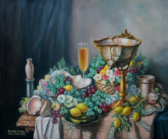
 Still Life with a Conch Shell Cup
Deciding what to paint is not always an easy task. This is true even when one already has a specific...
 Still Life with Shells and Fruits
This still life was painted in 2003 when painting was for me more enthusiasm than expertise. It was quite acceptable...
 A SHORT VISIT TO SUBIC BAY - (Part 2)
MY SECOND TRIP, in the company of some relatives, was a bit different as we were able to see other places inside the former military base and discover what was there that, at one time, we were not allowed to see them....
 LBC HOLDS BADMINTON TOURNAMENT
The brutal weather, strong winds and arduous travel hassles did not deter over 100 badminton enthusiasts from attending the 3rd LBC Fun Badminton tournament held April 15th, 2018....
 DTI brings “Flavours of the Philippines” to PriceSmart Richmond BC
28 April 2018. Vancouver, British Columbia – In its effort to increase awareness and appreciation for Filipino food...
 Fil-Oz Liverpool wowed the audience at the Children's Festival of Sydney 2018
The Children's Festival of Sydney was held on the 8th April 2018 at First Fleet Park, the Rocks, next to Circular...
 A Filipino journalist wins Pulitzer Prize
While browsing my Facebook on the afternoon of April 17, I chanced upon Manny Mogato’s surprising message “Praise you Jesus,...
 Historic snowfall and freezing rain in mid-April mark upbeat Filipino Workers 2nd Conference in Toronto
Snow and freezing rain and over 550 road accidents in the Toronto and the Greater Toronto Area (GTA) suburbs due...
 Devotees from all over Netherlands gathered to celebrate the 2018 Feast Of The Divine Mercy
The Divine Mercy of Jesus is a Catholic devotion associated with the repeated apparition of our Lord to Saint Faustina...
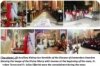
 `CON AMOR’ FOUNDATION B0ARD MEMBERS VISIT PROJECTS IN PHILIPPINES
Businessman Jaap van Dijke, chairman and two board members, Myrla Danao and Dr. John Deen of Con Amor foundation in...
 THE CHILDREN IN DON MANUEL GK VILLAGE
Sixty-three children from age three to six years, in the very poor community of Don Manuel village in Barangay...
 History of the Filipino Community in the Netherlands
Every story has a beginning and our story begins when a Cavitena accompanied her aunt to sail to another continent....
 Art Creations
Welcome!
Many believe formal training is a prerequisite to quality in painting. Not a few will agree with me one can...
Disclaimer
Contents posted in this site, muntingnayon.com, are the sole responsibility of the writers and do not reflect the editorial position of or the writers' affiliation with this website, the website owner, the webmaster and Munting Nayon News Magazine.
This site, muntingnayon.com, the website owner, the webmaster and Munting Nayon News Magazine do not knowingly publish false information and may not be held liable for any direct, indirect, incidental, consequential or punitive damages arising for any reason whatsoever from this website or from any web link used in this site.

29 years
of
Community Service
of
Community Service
MUNTING NAYON
News Magazine
Operated by couple Eddie Flores and Orquidia Valenzuela
News and Views of the
Filipino Community Worldwide
Filipino Community Worldwide
Extreme Makeover 4

Vicente Collado Jr.
Makati
Thu 11th October 2012
Deciding what to paint is not always an easy task. This is true even when one already has a specific theme in mind - a landscape, a still life, a portrait or a floral arrangement. The still endless possibilities for each theme almost always lead to indecision and inaction.
I was once browsing a book of classical paintings in 2003, while in a similar state of paralysis, when the "bright" idea of creating a painting by combining cut-outs from old masterpieces hit me.
This was how the model for this featured painting came to be. In a desperate effort to jumpstart a new project, I resorted to this cut-and-paste method which resulted in a triangular composition with the conch shell cup as the main attraction and the shells, platter, fruits, flowers and drapery as supporting cast.
This collage of Old Masters became my guide for this piece, and so, it should not be surprising if many of the items in the picture sound familiar.

Original Painting
I was still a neophyte then, a time when my primary concern was just to paint forms correctly, obsessed on realism but understandably oblivious of other equally important elements of a good painting like linear and aerial perspectives, unity, variety, harmony and contrast.
It goes without saying I was quite happy with the result. But, it never really struck me as convincing enough. I admit even something less should have been too much to keep me satisfied given my level of expertise then. But, even though the shells, fruits and other images looked lifelike, I just felt something was off, and the bigger problem was I never knew what it was.
Now, of course, just a brief glance at it instantly produces in me a long mental list of shortcomings.
For example, the dominant color (umber or brown) is so overpowering that the viewer is left with no energy to appreciate other aspects afterwards. This is specially true of the massive curtain in the background which was initially placed there as a color balance to the conch shell cup and table rug but which had the unwanted effect of absorbing all the viewer's attention.
Likewise, although the color umber as intended unifies all the elements in the canvas, it makes the whole work too warm to my liking. This suited me well then when I was doing it in the cold of winter. But, as I look at it now under ambient temperature of 45C, I simply have to cool it down a bit.
Also, despite my focus on realism, I failed to include some basic elements like body and cast shadows that would have added more volume. There are also several occurrences of "kissing" where the edges just touch, like in the clusters of lemons and the shells at the bottom left. And, I don't like how the front edge of the silver platter seems to be a continuation and a part of the marble table edge. And, lastly, the shells look anything but natural.
But, most importantly, the whole composition is a bit chaotic. This must have been the adverse effect of the cut-and-paste method; it is simply hard for different pieces yanked out from distinct settings to mesh perfectly. For sure, it can stand the test of any compositional analysis if one tries hard enough, but I feel that a more harmonious and unified distribution of colors, forms and patterns is still possible and within reach.
These and more are reasons enough for me to start another makeover.
The following sequence of images depicts the major stages of the modification. In them, one can have a general idea of how forms were relocated and reshaped, colors redistributed, intensity readjusted and patterns removed. The culmination is the picture below, a more cohesive and balanced composition.

Stage 1
To start the transformation, I quickly brushed in a cooler background, using titanium white, ivory black, blue, burnt umber and yellow ocher, getting rid of the bulky curtain in the process. The bluish coat makes the background recede, creating the needed atmosphere. The previous warm background advanced, making the whole scene flat.
Decision time. First, I swapped the white flowers with the lemons on the basket. As the focal point, the shell cup is where the greatest value contrast should be. This stronger contrast is achieved better with the white flowers adjacent to the dark underside of the cup. Then, I added more flowers to the right to balance the color white. Also, I extended the edge of the silver plate forward so as not to make it look like a continuation of the front edge of the marble table. Finally, I outlined what would be the final layout of the table drapery. The basic composition done, I proceeded with painting per se.
Everything looks messy after the basic colors of the grapes, lemon and leaves were applied. The bronze figures making a toast to each other were originally added out of fun and, having no compositional purpose, were duly discarded. The foundation for a more natural-looking color was also painted on the shells.

Stage 2
The fruits, flowers and leaves were remodeled with more appropriate body colors, body shadows and reflected lights. The transmitted light of some grapes, the little glows at the bottom in their shadow parts, were also added.
Another layer was added to the shells and the petals of the flowers were made for distinct and clear. The marble table and drapery were toned down, and the blue curtain was made a notch more intense.
The shells were given another coating in preparation for a richer finish, and the folds and creases of the table fabrics were finalized. Some green grapes and leaves were neutralized, and the jar in the background and the mortar were covered with earth color. The silver plate was reshaped and the wine was made more intense.[center

Stage 3
Some structural changes were made here. The background niche which compounded the 'riot' in the middle ground was leveled off, and the shell cup base was nudged to the right for stability.
The interiors of the shells were refined, and the grapes and lemons were given more texture.
The grapes were further remodeled. The shadows in the drapery were darkened and the flowers were reshaped more accurately. The white cloth was removed to allow a bigger part of the basket to show. Yellow ochre was used to warm the shell. More details were added to the outer surface of the shell cup.[center

Stage 4
Here, delicate work was done on the basket weave and the cup handle. The distant jar and the mortar were also mellowed down.
The cast shadow on the mortar was darkened, and the middle shell was enlarged to show its real structure. Furry texture and design patterns were added to the table rug.
The background colors were brushed into the inner sides of the shells to simulate their shiny prismatic nature. The surrounding area of the middle shell was also darkened for greater contrast. More details were built into the tapestry, basket, mortar and distant jar.

Stage 5
The smallest shell was lightened, some flowers and leaves were refined, the column was retouched, and the reflections of the lemons and grapes were painted on the plate.
The cup handle was reshaped and brightened, and the grapes and lemons were coated with another layer.
The conch shell was adorned with more grooves and growth line patterns.

Stage 6
Intense colors (red and yellow flowers and green leaves) were added to spice up the focal area. Hints of transmitted light were also painted on the shadow side of the shell cup.
The intense yellow of the lemons were subdued by glazing them with light green, making them look like young lemons. Highlights and shadows were applied into the brass casing of the shell cup.
The grapes were given their defining highlights. The transparent wine glass was finally painted. Minor touch-ups were also done on the cup handle, on the white table cloth and on the blue background curtain and its partner, the blue table cloth.
Still Life with Copper Trinkets
Oil on Canvas
50cm x 60cm
To finish, the background was glazed with a final coating. The wine was lightened and the glass stem was given a highlight. The reflections were added into the column and cup handle to make them blend with their surroundings. Final touch-ups were made where needed.
In this modified version, the dominant color brown has been replaced with a muted light orange - table rug and background. This color was chosen to complement the blue curtain and table cloth on the right. Its dullness ensures that it will stick to its supporting role always.
A greater balance in color and form was also achieved. The background color scheme (blue and pastel orange) is mirrored in the foreground (blue and pastel orange fabrics). The white table cloth is a counterweight to the white flowers and inner white surfaces of the shells. The light brown jar on left balances the mortar on the right. The conch shell cup is held in equilibrium by the shells on the left. The pedestal and silver platter offset each other.
To strengthen the unity of the composition, the conch shell cup was set on a broad swatch of green, yellow and burgundy (grapes, lemons and flowers) that spans across midway across the canvas. These act like threads that stitch all the elements into one piece.
Finally, to lead the viewer's eyes to the conch shell cup, the center of interest, I first made sure the greatest contrasts are situated around it. Value-wise, it is here where I placed the darkest dark (the underside tip of the shell) together with the lightest light (white petals). Second, I situated the most intense colors also in this area. The most vivid pinks and yellows are contiguous to the cup. I deliberately dulled the other yellows (lemons) and pinks (flowers)in the peripherals to silence them. Third, I made the drapery folds and rug border patterns all point to the focal point. Fourth, the sharper and more defined edges are also in the focal area; the edges of the leaves and other forms outside this area are blurred on purpose. Finally, I retained the bamboo basket in its original place as a strong textural contrast to the hard rock shell and the gold metal cup handle.
Naturally, I am much happier with this revised version, having achieved - at least, according to my judgment - all the goals I've initially set for myself. Screaming colors have been eliminated except in the focal point where they are needed; a solid equilibrium has been established among the contrasting shapes and colors; and, despite the initial impression of anarchy and chaos, unity and harmony actually reign supreme over the whole composition.
Still Life with a Conch Shell Cup
Vicente Collado Jr.
Makati
Thu 11th October 2012
Deciding what to paint is not always an easy task. This is true even when one already has a specific theme in mind - a landscape, a still life, a portrait or a floral arrangement. The still endless possibilities for each theme almost always lead to indecision and inaction.
I was once browsing a book of classical paintings in 2003, while in a similar state of paralysis, when the "bright" idea of creating a painting by combining cut-outs from old masterpieces hit me.
This was how the model for this featured painting came to be. In a desperate effort to jumpstart a new project, I resorted to this cut-and-paste method which resulted in a triangular composition with the conch shell cup as the main attraction and the shells, platter, fruits, flowers and drapery as supporting cast.
This collage of Old Masters became my guide for this piece, and so, it should not be surprising if many of the items in the picture sound familiar.
I was still a neophyte then, a time when my primary concern was just to paint forms correctly, obsessed on realism but understandably oblivious of other equally important elements of a good painting like linear and aerial perspectives, unity, variety, harmony and contrast.
It goes without saying I was quite happy with the result. But, it never really struck me as convincing enough. I admit even something less should have been too much to keep me satisfied given my level of expertise then. But, even though the shells, fruits and other images looked lifelike, I just felt something was off, and the bigger problem was I never knew what it was.
Now, of course, just a brief glance at it instantly produces in me a long mental list of shortcomings.
For example, the dominant color (umber or brown) is so overpowering that the viewer is left with no energy to appreciate other aspects afterwards. This is specially true of the massive curtain in the background which was initially placed there as a color balance to the conch shell cup and table rug but which had the unwanted effect of absorbing all the viewer's attention.
Likewise, although the color umber as intended unifies all the elements in the canvas, it makes the whole work too warm to my liking. This suited me well then when I was doing it in the cold of winter. But, as I look at it now under ambient temperature of 45C, I simply have to cool it down a bit.
Also, despite my focus on realism, I failed to include some basic elements like body and cast shadows that would have added more volume. There are also several occurrences of "kissing" where the edges just touch, like in the clusters of lemons and the shells at the bottom left. And, I don't like how the front edge of the silver platter seems to be a continuation and a part of the marble table edge. And, lastly, the shells look anything but natural.
But, most importantly, the whole composition is a bit chaotic. This must have been the adverse effect of the cut-and-paste method; it is simply hard for different pieces yanked out from distinct settings to mesh perfectly. For sure, it can stand the test of any compositional analysis if one tries hard enough, but I feel that a more harmonious and unified distribution of colors, forms and patterns is still possible and within reach.
These and more are reasons enough for me to start another makeover.
The following sequence of images depicts the major stages of the modification. In them, one can have a general idea of how forms were relocated and reshaped, colors redistributed, intensity readjusted and patterns removed. The culmination is the picture below, a more cohesive and balanced composition.
To start the transformation, I quickly brushed in a cooler background, using titanium white, ivory black, blue, burnt umber and yellow ocher, getting rid of the bulky curtain in the process. The bluish coat makes the background recede, creating the needed atmosphere. The previous warm background advanced, making the whole scene flat.
Decision time. First, I swapped the white flowers with the lemons on the basket. As the focal point, the shell cup is where the greatest value contrast should be. This stronger contrast is achieved better with the white flowers adjacent to the dark underside of the cup. Then, I added more flowers to the right to balance the color white. Also, I extended the edge of the silver plate forward so as not to make it look like a continuation of the front edge of the marble table. Finally, I outlined what would be the final layout of the table drapery. The basic composition done, I proceeded with painting per se.
Everything looks messy after the basic colors of the grapes, lemon and leaves were applied. The bronze figures making a toast to each other were originally added out of fun and, having no compositional purpose, were duly discarded. The foundation for a more natural-looking color was also painted on the shells.
The fruits, flowers and leaves were remodeled with more appropriate body colors, body shadows and reflected lights. The transmitted light of some grapes, the little glows at the bottom in their shadow parts, were also added.
Another layer was added to the shells and the petals of the flowers were made for distinct and clear. The marble table and drapery were toned down, and the blue curtain was made a notch more intense.
The shells were given another coating in preparation for a richer finish, and the folds and creases of the table fabrics were finalized. Some green grapes and leaves were neutralized, and the jar in the background and the mortar were covered with earth color. The silver plate was reshaped and the wine was made more intense.[center
Some structural changes were made here. The background niche which compounded the 'riot' in the middle ground was leveled off, and the shell cup base was nudged to the right for stability.
The interiors of the shells were refined, and the grapes and lemons were given more texture.
The grapes were further remodeled. The shadows in the drapery were darkened and the flowers were reshaped more accurately. The white cloth was removed to allow a bigger part of the basket to show. Yellow ochre was used to warm the shell. More details were added to the outer surface of the shell cup.[center
Here, delicate work was done on the basket weave and the cup handle. The distant jar and the mortar were also mellowed down.
The cast shadow on the mortar was darkened, and the middle shell was enlarged to show its real structure. Furry texture and design patterns were added to the table rug.
The background colors were brushed into the inner sides of the shells to simulate their shiny prismatic nature. The surrounding area of the middle shell was also darkened for greater contrast. More details were built into the tapestry, basket, mortar and distant jar.
The smallest shell was lightened, some flowers and leaves were refined, the column was retouched, and the reflections of the lemons and grapes were painted on the plate.
The cup handle was reshaped and brightened, and the grapes and lemons were coated with another layer.
The conch shell was adorned with more grooves and growth line patterns.
Intense colors (red and yellow flowers and green leaves) were added to spice up the focal area. Hints of transmitted light were also painted on the shadow side of the shell cup.
The intense yellow of the lemons were subdued by glazing them with light green, making them look like young lemons. Highlights and shadows were applied into the brass casing of the shell cup.
The grapes were given their defining highlights. The transparent wine glass was finally painted. Minor touch-ups were also done on the cup handle, on the white table cloth and on the blue background curtain and its partner, the blue table cloth.
Oil on Canvas
50cm x 60cm
To finish, the background was glazed with a final coating. The wine was lightened and the glass stem was given a highlight. The reflections were added into the column and cup handle to make them blend with their surroundings. Final touch-ups were made where needed.
In this modified version, the dominant color brown has been replaced with a muted light orange - table rug and background. This color was chosen to complement the blue curtain and table cloth on the right. Its dullness ensures that it will stick to its supporting role always.
A greater balance in color and form was also achieved. The background color scheme (blue and pastel orange) is mirrored in the foreground (blue and pastel orange fabrics). The white table cloth is a counterweight to the white flowers and inner white surfaces of the shells. The light brown jar on left balances the mortar on the right. The conch shell cup is held in equilibrium by the shells on the left. The pedestal and silver platter offset each other.
To strengthen the unity of the composition, the conch shell cup was set on a broad swatch of green, yellow and burgundy (grapes, lemons and flowers) that spans across midway across the canvas. These act like threads that stitch all the elements into one piece.
Finally, to lead the viewer's eyes to the conch shell cup, the center of interest, I first made sure the greatest contrasts are situated around it. Value-wise, it is here where I placed the darkest dark (the underside tip of the shell) together with the lightest light (white petals). Second, I situated the most intense colors also in this area. The most vivid pinks and yellows are contiguous to the cup. I deliberately dulled the other yellows (lemons) and pinks (flowers)in the peripherals to silence them. Third, I made the drapery folds and rug border patterns all point to the focal point. Fourth, the sharper and more defined edges are also in the focal area; the edges of the leaves and other forms outside this area are blurred on purpose. Finally, I retained the bamboo basket in its original place as a strong textural contrast to the hard rock shell and the gold metal cup handle.
Naturally, I am much happier with this revised version, having achieved - at least, according to my judgment - all the goals I've initially set for myself. Screaming colors have been eliminated except in the focal point where they are needed; a solid equilibrium has been established among the contrasting shapes and colors; and, despite the initial impression of anarchy and chaos, unity and harmony actually reign supreme over the whole composition.
Tweet
Eruptive Past Revisited
Vicente Collado Jr.
Many scenic spots of the Philippines are often the favorite subjects of painters. When I was beginning to paint,...
Still Life with a White Vase and Flowers
Vicente Collado Jr.
Our repatriation to the Philippines a couple of years ago had one big casualty - my painting momentum. It was...
Still Life with a Conch Shell Cup
Vicente Collado Jr.
Deciding what to paint is not always an easy task. This is true even when one already has a specific...
Still Life with Shells and Fruits
Vicente Collado Jr.
This still life was painted in 2003 when painting was for me more enthusiasm than expertise. It was quite acceptable...
A SHORT VISIT TO SUBIC BAY - (Part 2)
Mga Gintong Kwento ni Rene Calalang
MY SECOND TRIP, in the company of some relatives, was a bit different as we were able to see other places inside the former military base and discover what was there that, at one time, we were not allowed to see them....
LBC HOLDS BADMINTON TOURNAMENT
Fe Taduran
The brutal weather, strong winds and arduous travel hassles did not deter over 100 badminton enthusiasts from attending the 3rd LBC Fun Badminton tournament held April 15th, 2018....
DTI brings “Flavours of the Philippines” to PriceSmart Richmond BC
Trade Office Section
28 April 2018. Vancouver, British Columbia – In its effort to increase awareness and appreciation for Filipino food...
Fil-Oz Liverpool wowed the audience at the Children's Festival of Sydney 2018
Richard J. Ford
The Children's Festival of Sydney was held on the 8th April 2018 at First Fleet Park, the Rocks, next to Circular...
A Filipino journalist wins Pulitzer Prize
Willie Jose
While browsing my Facebook on the afternoon of April 17, I chanced upon Manny Mogato’s surprising message “Praise you Jesus,...
Historic snowfall and freezing rain in mid-April mark upbeat Filipino Workers 2nd Conference in Toronto
Edwin Cordero Mercurio
Snow and freezing rain and over 550 road accidents in the Toronto and the Greater Toronto Area (GTA) suburbs due...
Devotees from all over Netherlands gathered to celebrate the 2018 Feast Of The Divine Mercy
Angel Axinto
The Divine Mercy of Jesus is a Catholic devotion associated with the repeated apparition of our Lord to Saint Faustina...
 `CON AMOR’ FOUNDATION B0ARD MEMBERS VISIT PROJECTS IN PHILIPPINES
By: Orquidia. Valenzuela, as reported by Myrla Danao
Businessman Jaap van Dijke, chairman and two board members, Myrla Danao and Dr. John Deen of Con Amor foundation in...
THE CHILDREN IN DON MANUEL GK VILLAGE
Orquidia Valenzuela Flores
Sixty-three children from age three to six years, in the very poor community of Don Manuel village in Barangay...
History of the Filipino Community in the Netherlands
Orquidia Flores-Valenzuela
Every story has a beginning and our story begins when a Cavitena accompanied her aunt to sail to another continent....
Art Creations
Vicente Collado Jr.
Welcome!
Many believe formal training is a prerequisite to quality in painting. Not a few will agree with me one can...
Contents posted in this site, muntingnayon.com, are the sole responsibility of the writers and do not reflect the editorial position of or the writers' affiliation with this website, the website owner, the webmaster and Munting Nayon News Magazine.
This site, muntingnayon.com, the website owner, the webmaster and Munting Nayon News Magazine do not knowingly publish false information and may not be held liable for any direct, indirect, incidental, consequential or punitive damages arising for any reason whatsoever from this website or from any web link used in this site.